London
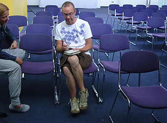
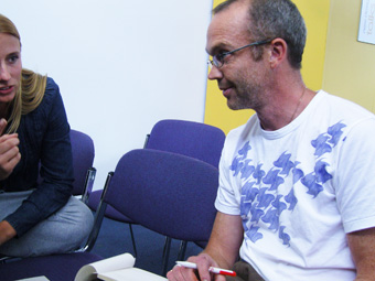
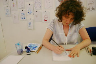
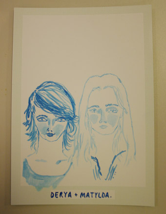
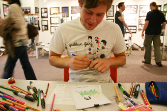
grafik is a magazine about graphic design. edited monthly, there is a lot to see and read about two-dimensional design. grafik has a stand at the new designers and some illustrators at the stand who were drawing people. I present 2 of them. yes, they have drawn us – my friend derya inanici and me.
emily robertson
find her at plats, a creative community for artist
david sparshott
check him out
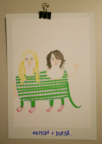
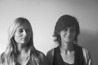
the original
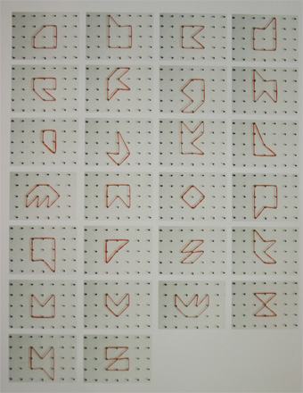
I’ve been at the new designers, the british show of graduated design. there is a lot I want to show but one of my specials was the ‘take part’ typeface of edward nugent.
so, I am in london now. and this is the largest multi-arts centre in europe. people use to call it london’s ugliest building. but when the queen opened it in 1982 she pronounced it ‘one of the wonders of the modern world’. In the end the barbican is the microcosm of london.
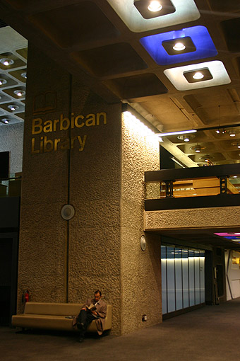
library
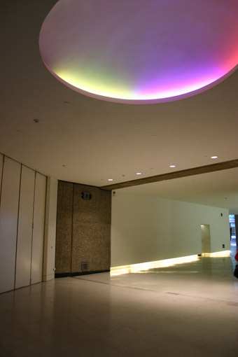
the entry hall
 barbican graphics
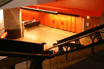 hall, -1
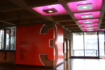
the 3rd floor
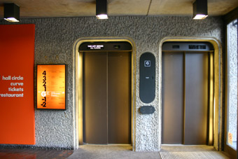 elevators
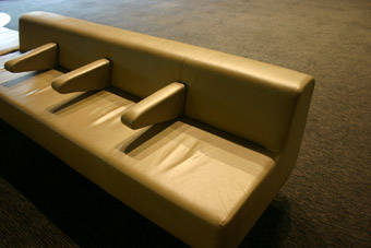
couch
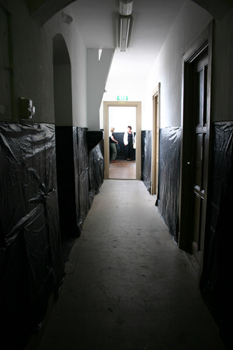
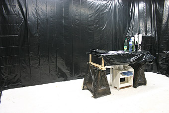
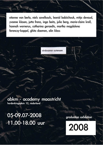
the horses strike again. we’ve covered the wall inside the fine arts building with black plastic bags to arrange the exhibition as a whole. (now you have the link why I used plastic bags for the poster and the catalogue) 14 different artists are presenting their work, which is their graduation. it was a pleasure and sometimes a challenge to bring these people together but in the end we are proud that we had the chance to support them and to organize their last collective presentation at the academy maastricht.
2nd floor, ‘stuers’ (it’s how people call it) building
the luxe paarden in actie (‘luxury horses in action’)
office during the exhibition
jutta frenz
durchsicht, 00.02.00 min video, on the left side, 2007
ghita daemen
iso 7, installation, 2008
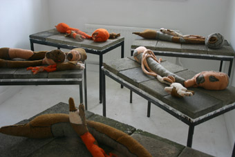
marie-claire krell
213,85 m3, installation (a fraction of the installation) 2008
I saw the ‘It’s always six o’clock’ couple days ago. now you will find a new exhibition at the mu eindhoven, museum for temporary art. but after recurrent conversations about the pros and cons of second life I feel the need to show the work of eva and franco mattes.
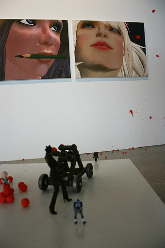
toys vs. avatars
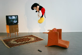
tv kills mickey
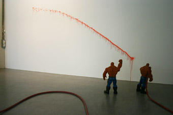
‘hey fake hulk, let’s spatter some paint on the wall’
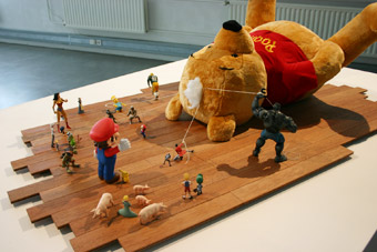
I never liked winnie pooh, he is too babyish
watch the pop culture clash or could I say generation now?
incl. an interview with the artists
video by
designguide.tv
me and my colleague and friend miriam hartwig, we both call ourselves ‘luxe paarden in actie’ while we are organising our idea of social happenings, sincerely invite to the graduation show of the fine arts students 2008 of the academy maastricht. more information about the exhibition will come soon.
another academy year is almost over (next year, 2009, will be my graduation year) 2 months ago we had the assignment to exhibit one of our products somewhere in the city. unfortunatly I couldn’t make it to the date. my academic, krien clevis, told me that I can get my desired point if I post one of my products on matandme. I took this picture on sunday in the ainsi builing during an exhibition. the woman is my mum and the paperdog belongs to jens schumacher‘s graduation project. It was a fortunate coincidence.
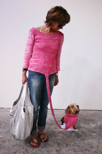
concept sweater ‘hunsch’
(the name embodies the symbiosis of the german words hund (dog) and mensch (human). the basic idea is the ‘social irrelevance’ of the personification of dogs. the inspiration comes from paris hilton, protagonist of the dog accessory. the fabric is selfknitted and the choice of colour is based on all fashionable girls with their little doggies. yes, I am a little bit ironic again.