Most websites are made without a characteristic style, in my opinion. Most of the time there is a certain dominating arche-type. You see the same fonts (verdana, arial, trebuchet ms etc.) and in the majority of cases the same composition.
Here’s a case which goes for more individuality:
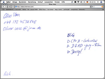
| oliver voss |
It’s the Homepage of Oliver Voss – one of Jung van Matt’s creative heads. He is inventor of the slogans ‘Du bist Deutschland’ ( You are Germany ) and ‘3 . . . 2 . . . 1 . . . meins!’ – Ebay ( 3 . . . 2 . . . 1 . . . mine!) who are 2 of the most known slogans in Germany. Oliver likes it short with a likeable directness. That’s how advertising should be. And I think you also see it in the style of his website.