Divider by Mieke Meijer
Not far from Eindhoven train station, in an old industrial building that is usually used as studio spaces, was the opening of the Dutch Invertuals during Dutch Design Week 2012. On a Thursday evening, friends, followers and lovers of high aesthetics in products but also in exhibition design gathered to celebrate on another edition of Wendy Plomp’s curating skills.

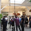
Exhibition view
The setting was, as always, intriguing: you entered a giant space with high ceilings and spotlights directed into a circle of wooden panels that faced each other. Inside the circle the work of all participating designers was arranged. On one hand the scenario reminded me of a movie set and on the other it was more like the placards found durning a demonstration, a situation that is most likely to be compared to a conflict.

Detail of Divider by Mieke Meijer
As usual there are projects that I am specifically very fond of: Mieke Meijer’s divider that was standing heroic in the centre of the circle, like the protagonist of the movie ‘Conflict”. All surrounded by a diverse selection of designers from around the globe who all gather under the umbrella of “Dutch” Design.

Initiated and curated by Wendy Plomp
For me these events, have become less about the featured individuals and more about the actual execution of the exhibition and the graphic design. I left the event at ease, imagining how the panels start moving towards each other. Like in a scene of a movie.

This year’s edition during Dutch Design Week is themed: CONFLICT

To The Bone by Jetske Visser and Michel Martens

Index Collection by Raw Color

Index Collection by Raw Color

Colour Collision by Kirstie van Noort & Rogier Arents

Oxidations by EDHV

Phases by Jeroen Wand

Pipeline by Adrien Petrucci & Olivia de Gouveia

Steel yourself by Max Lipsey

Niek Pulles, curator of this year’s Modebelofte and Anna Bates, freelance writer